

Transforming NatGeo Ultimate Explorer E-Commerce Experience & CRO
Transforming NatGeo Ultimate Explorer E-Commerce Experience & CRO
This case study highlights the redesign of the e-commerce webpage for National Geographic Ultimate Explorer Experience in Abu Dhabi. We focused on improving ticket selection, reducing the number of decisions users face early on, and showcasing the center’s seven unique attractions with engaging visuals. By streamlining the purchase process and making the site more playful, parents and kids can now quickly find the right ticket or membership option, explore the attractions, and complete their purchase in a few simple steps.
This case study highlights the redesign of the e-commerce webpage for National Geographic Ultimate Explorer Experience in Abu Dhabi. We focused on improving ticket selection, reducing the number of decisions users face early on, and showcasing the center’s seven unique attractions with engaging visuals. By streamlining the purchase process and making the site more playful, parents and kids can now quickly find the right ticket or membership option, explore the attractions, and complete their purchase in a few simple steps.
This case study highlights the redesign of the e-commerce webpage for National Geographic Ultimate Explorer Experience in Abu Dhabi. We focused on improving ticket selection, reducing the number of decisions users face early on, and showcasing the center’s seven unique attractions with engaging visuals. By streamlining the purchase process and making the site more playful, parents and kids can now quickly find the right ticket or membership option, explore the attractions, and complete their purchase in a few simple steps.
Deliverables
UX Research
Conversion rate Optimization
UI Design
Interaction Design
Tools
Figjam/Figma
Timeline
4 Weeks
Natgeo
UX Shine

The Problem
The existing Ultimate Explorer website lacked clarity, overwhelmed users with decisions, and offered a frustrating shopping experience—especially for parents looking to plan birthday parties or educational outings.
The existing Ultimate Explorer website lacked clarity, overwhelmed users with decisions, and offered a frustrating shopping experience—especially for parents looking to plan birthday parties or educational outings.
The existing Ultimate Explorer website lacked clarity, overwhelmed users with decisions, and offered a frustrating shopping experience—especially for parents looking to plan birthday parties or educational outings.
The Solution
We simplified the user journey by reorganizing ticket selections into clear categories, improved navigation with visuals, optimized the checkout flow, and added vibrant visuals showcasing real experiences. This transformed the experience into something seamless and enjoyable.
We simplified the user journey by reorganizing ticket selections into clear categories, improved navigation with visuals, optimized the checkout flow, and added vibrant visuals showcasing real experiences. This transformed the experience into something seamless and enjoyable.
We simplified the user journey by reorganizing ticket selections into clear categories, improved navigation with visuals, optimized the checkout flow, and added vibrant visuals showcasing real experiences. This transformed the experience into something seamless and enjoyable.
Discovery & Research
Discovery & Research
Personas
We had 2 primary personas:
1. Experience-Seeking Parent: A parent looking for quick, fuss-free ticket bookings to provide inspiring weekend adventures for their child.
2. Birthday Planner Parent: A parent who needs a visually engaging and simple way to arrange a memorable, educational party.
We had 2 primary personas:
1. Experience-Seeking Parent: A parent looking for quick, fuss-free ticket bookings to provide inspiring weekend adventures for their child.
2. Birthday Planner Parent: A parent who needs a visually engaging and simple way to arrange a memorable, educational party.
We had 2 primary personas:
1. Experience-Seeking Parent: A parent looking for quick, fuss-free ticket bookings to provide inspiring weekend adventures for their child.
2. Birthday Planner Parent: A parent who needs a visually engaging and simple way to arrange a memorable, educational party.


Business & User frustrations
Primary Frustration
Primary Frustration
Primary Frustration
The existing design led to high drop-off rates because users were overwhelmed by too many ticket types and insufficient attraction visuals. Parents were unsure which ticket was best for their situation, and kids saw no engaging visuals to spark excitement.
The existing design led to high drop-off rates because users were overwhelmed by too many ticket types and insufficient attraction visuals. Parents were unsure which ticket was best for their situation, and kids saw no engaging visuals to spark excitement.
Secondary Frustration
Secondary Frustration
Secondary Frustration
The website lacked a clear structure, limiting potential upselling of memberships or special offers. The checkout flow felt clumsy, requiring multiple steps across different screens, risking abandoned carts.
The website lacked a clear structure, limiting potential upselling of memberships or special offers. The checkout flow felt clumsy, requiring multiple steps across different screens, risking abandoned carts.
The website lacked a clear structure, limiting potential upselling of memberships or special offers. The checkout flow felt clumsy, requiring multiple steps across different screens, risking abandoned carts.
Direct Competitor Benchmarking
Direct Competitor Benchmarking
• Disneyland:
Exceptional ticket-selection interface, visually appealing experiences, smooth checkout.
• Atlantis Aquaventure:
Engaging visuals, clear and structured ticketing flow.
• Disneyland:
Exceptional ticket-selection interface, visually appealing experiences, smooth checkout.
• Atlantis Aquaventure:
Engaging visuals, clear and structured ticketing flow.
• Disneyland:
Exceptional ticket-selection interface, visually appealing experiences, smooth checkout.
• Atlantis Aquaventure:
Engaging visuals, clear and structured ticketing flow.
Inirect Competitor Benchmarking
Inirect Competitor Benchmarking
• SeaWorld Yas Island Abu Dhabi:
Effective use of imagery and streamlined checkout.
• Canada’s Wonderland:
Great events presentation, visually clear categorization.
• SeaWorld Yas Island Abu Dhabi:
Effective use of imagery and streamlined checkout.
• Canada’s Wonderland:
Great events presentation, visually clear categorization.
• SeaWorld Yas Island Abu Dhabi:
Effective use of imagery and streamlined checkout.
• Canada’s Wonderland:
Great events presentation, visually clear categorization.


Competitors simplified user decisions through clear visuals, categorized tickets intuitively, and highlighted real experiences—exactly what our users were missing.
Competitors simplified user decisions through clear visuals, categorized tickets intuitively, and highlighted real experiences—exactly what our users were missing.
Competitors simplified user decisions through clear visuals, categorized tickets intuitively, and highlighted real experiences—exactly what our users were missing.
Ideation & Prioritization
Ideation & Prioritization
Problem Space
Users found it difficult to select the right tickets or discover the variety of experiences available. The existing site forced them to navigate multiple pages, offered limited images, and asked too many questions upfront—hindering a smooth path to checkout.
Users found it difficult to select the right tickets or discover the variety of experiences available. The existing site forced them to navigate multiple pages, offered limited images, and asked too many questions upfront—hindering a smooth path to checkout.
Users found it difficult to select the right tickets or discover the variety of experiences available. The existing site forced them to navigate multiple pages, offered limited images, and asked too many questions upfront—hindering a smooth path to checkout.
Answering the Big Question
Answering the Big Question
Answering the Big Question
How Might We… Make the website more appealing and easier to select and understand the ticketing structure
Mind Mapping
We explored ways to group ticket categories, integrate a photo gallery, highlight attractions, and simplify the checkout. The brainstorming focused on how best to group offers and effectively display everything from daily admissions to special birthday packages.
We explored ways to group ticket categories, integrate a photo gallery, highlight attractions, and simplify the checkout. The brainstorming focused on how best to group offers and effectively display everything from daily admissions to special birthday packages.
We explored ways to group ticket categories, integrate a photo gallery, highlight attractions, and simplify the checkout. The brainstorming focused on how best to group offers and effectively display everything from daily admissions to special birthday packages.

Main Takeaways
Simplify ticket selection (grouped categories).
Enhance visuals (add photo galleries for attractions).
Streamline checkout process (reduce pages).
Clarify navigation (persistent shopping cart).
Improve birthday event presentation (clear, engaging section).
Purchase Flow
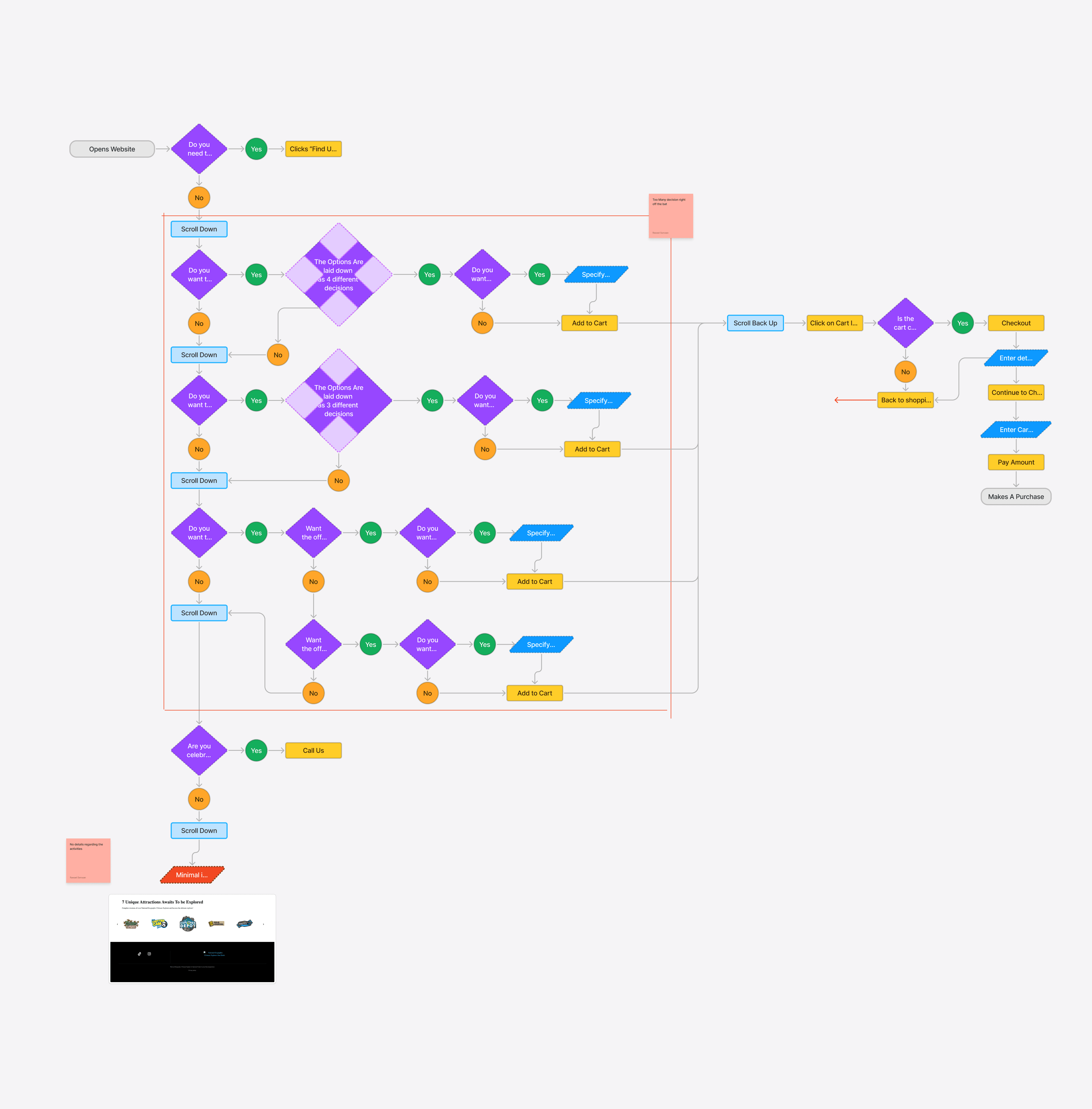
In the existing flow, users faced a cluttered main page showing multiple ticket categories without clear explanations or visuals. Critical details where scattered around the page leaving users guessing. At the same time, visitors had to make multiple decisions up front without any guiding context. This lack of clarity and high cognitive load led to confusion, extended browsing times, and an increased likelihood of cart abandonment.
In the existing flow, users faced a cluttered main page showing multiple ticket categories without clear explanations or visuals. Critical details where scattered around the page leaving users guessing. At the same time, visitors had to make multiple decisions up front without any guiding context. This lack of clarity and high cognitive load led to confusion, extended browsing times, and an increased likelihood of cart abandonment.
In the existing flow, users faced a cluttered main page showing multiple ticket categories without clear explanations or visuals. Critical details where scattered around the page leaving users guessing. At the same time, visitors had to make multiple decisions up front without any guiding context. This lack of clarity and high cognitive load led to confusion, extended browsing times, and an increased likelihood of cart abandonment.
Rapid Prototyping & Moodboard
In this phase, we sketched out how to position the hero section, navigation, and simplified ticket categories. Wireframes tested whether grouping offers into three categories truly reduced user confusion. This allowed us to validate design assumptions quickly and iterate on placing the checkout pop-ups.
In this phase, we sketched out how to position the hero section, navigation, and simplified ticket categories. Wireframes tested whether grouping offers into three categories truly reduced user confusion. This allowed us to validate design assumptions quickly and iterate on placing the checkout pop-ups.
In this phase, we sketched out how to position the hero section, navigation, and simplified ticket categories. Wireframes tested whether grouping offers into three categories truly reduced user confusion. This allowed us to validate design assumptions quickly and iterate on placing the checkout pop-ups.

Styles & Components
We maintained National Geographic’s brand identity while adding playful elements to appeal to children. New components included image carousels for attractions, pop-up checkout modules, and bright CTA buttons. Typography remained clean and easily scannable, with consistent color themes that reflect adventure and exploration.
We maintained National Geographic’s brand identity while adding playful elements to appeal to children. New components included image carousels for attractions, pop-up checkout modules, and bright CTA buttons. Typography remained clean and easily scannable, with consistent color themes that reflect adventure and exploration.
We maintained National Geographic’s brand identity while adding playful elements to appeal to children. New components included image carousels for attractions, pop-up checkout modules, and bright CTA buttons. Typography remained clean and easily scannable, with consistent color themes that reflect adventure and exploration.
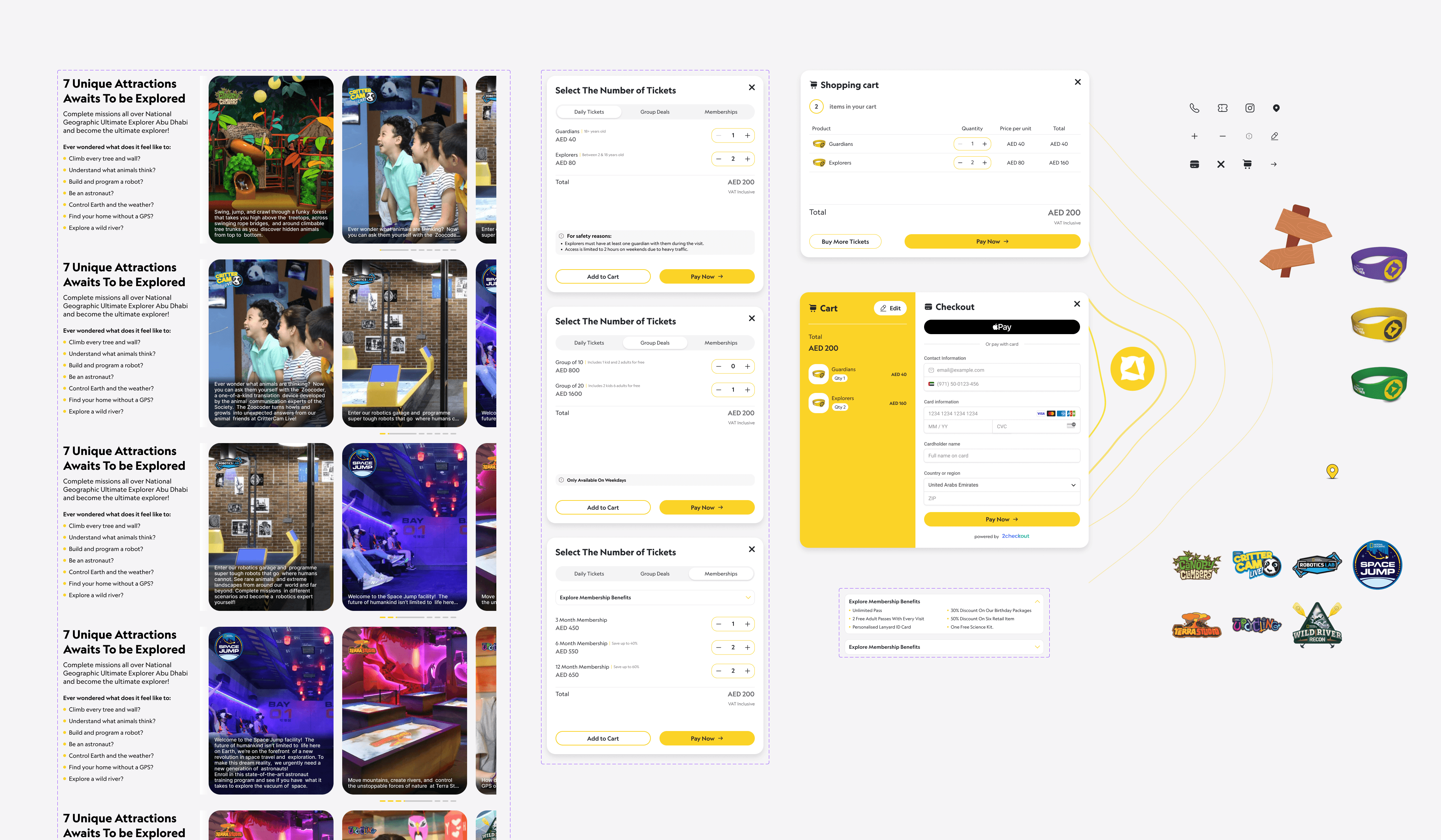
We kept the same yellow and black from the iconic nat geo identity with the playful touch of the ultimate explorer vr world
High Fidelity Prototype
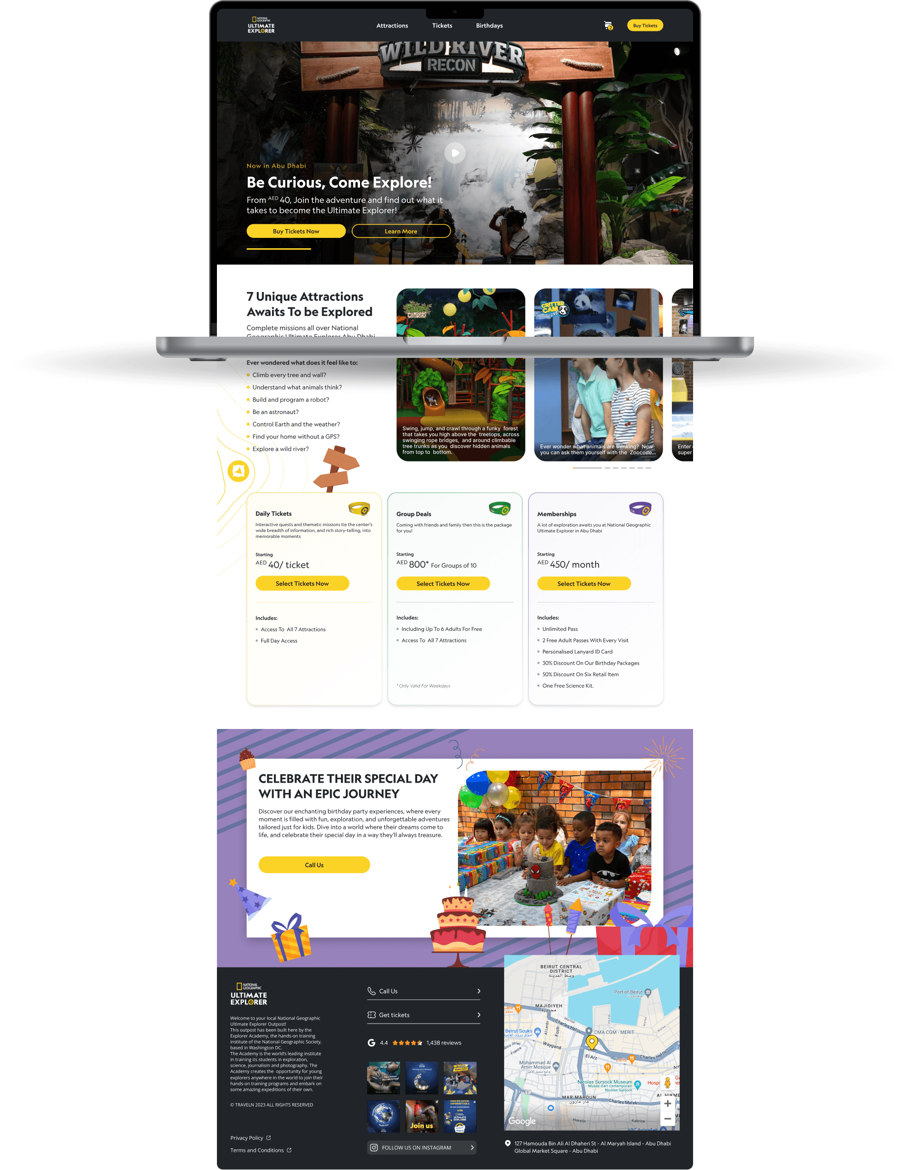
The final high-fidelity designs combine an immersive hero banner, clear ticket groupings, and an easy-to-use pop-up checkout. By showcasing attraction images at the top, the site immediately grabs attention. A single-page design approach keeps the experience seamless, and interactive elements like an image carousel and map markers maintain engagement. This polished layout ensures parents and kids can book visits with minimal friction and maximum excitement.
The final high-fidelity designs combine an immersive hero banner, clear ticket groupings, and an easy-to-use pop-up checkout. By showcasing attraction images at the top, the site immediately grabs attention. A single-page design approach keeps the experience seamless, and interactive elements like an image carousel and map markers maintain engagement. This polished layout ensures parents and kids can book visits with minimal friction and maximum excitement.
The final high-fidelity designs combine an immersive hero banner, clear ticket groupings, and an easy-to-use pop-up checkout. By showcasing attraction images at the top, the site immediately grabs attention. A single-page design approach keeps the experience seamless, and interactive elements like an image carousel and map markers maintain engagement. This polished layout ensures parents and kids can book visits with minimal friction and maximum excitement.

More Case Studies
More Case Studies
More Case Studies


Load More
What are you waiting for
Get started now, with our 14 days money back guarantee what are you waiting for? Let's build a product your users will love.
14 Days Money Back Guarantee
Pause & Launch At Your Convenience
Transparent Fixed Pricing