Redefining Trip Planning with a Powerful Map Experience
Redefining Trip Planning with a Powerful Map Experience
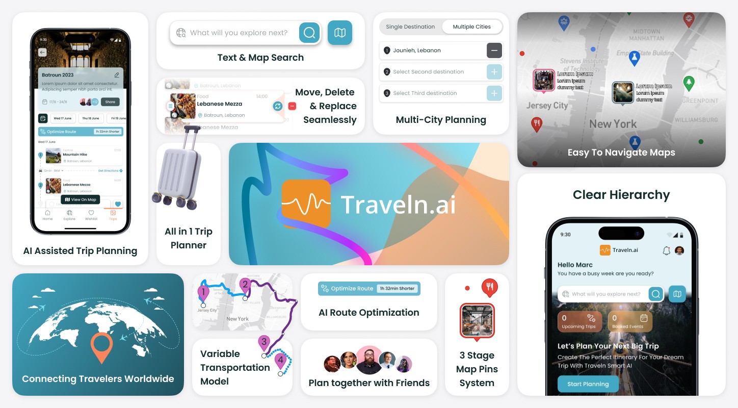
Traveln.ai wanted an easy way for everyone to plan trips, explore new places, and save time. By focusing on a dynamic map experience, we aimed to give users a quick overview of top spots, hidden gems, and an AI trip planner—all in one place.
Traveln.ai wanted an easy way for everyone to plan trips, explore new places, and save time. By focusing on a dynamic map experience, we aimed to give users a quick overview of top spots, hidden gems, and an AI trip planner—all in one place.
Traveln.ai wanted an easy way for everyone to plan trips, explore new places, and save time. By focusing on a dynamic map experience, we aimed to give users a quick overview of top spots, hidden gems, and an AI trip planner—all in one place.
Deliverables
UX Research
Product Strategy
UI Design
Interaction Design
Tools
Figjam/Figma
Notion
Timeline
6 weeks
The Problem
Traveln.ai’s app lacked a proper map feature and had confusing user flows. Onboarding felt clunky, important buttons were hard to find, and users couldn’t see all the places they wanted in one spot.
Traveln.ai’s app lacked a proper map feature and had confusing user flows. Onboarding felt clunky, important buttons were hard to find, and users couldn’t see all the places they wanted in one spot.
Traveln.ai’s app lacked a proper map feature and had confusing user flows. Onboarding felt clunky, important buttons were hard to find, and users couldn’t see all the places they wanted in one spot.
The Solution
Easy-to-use map experience, Arranged navigation, shorter User Flows making sure we find the easiest path to a users goal. Now, Traveln.ai can give travelers a seamless experience while opening up extra revenue with sponsored pins.
Easy-to-use map experience, Arranged navigation, shorter User Flows making sure we find the easiest path to a users goal. Now, Traveln.ai can give travelers a seamless experience while opening up extra revenue with sponsored pins.
Easy-to-use map experience, Arranged navigation, shorter User Flows making sure we find the easiest path to a users goal. Now, Traveln.ai can give travelers a seamless experience while opening up extra revenue with sponsored pins.
Our Human-Centered Approach
Our Human-Centered Approach
Our Human-Centered Approach
Five Steps to Better Experiences
Five Steps to Better Experiences
Five Steps to Better Experiences
Traveln.AI
UX Shine
Emphasis
Define
Ideate
Prototype
Test
Discovery & Research
Discovery & Research
UX Audit Findings
Before we made big changes, we checked how the existing app worked. We found problems like missing map tools, confusing buttons, and slow onboarding steps.
Before we made big changes, we checked how the existing app worked. We found problems like missing map tools, confusing buttons, and slow onboarding steps.
Before we made big changes, we checked how the existing app worked. We found problems like missing map tools, confusing buttons, and slow onboarding steps.

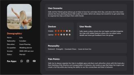
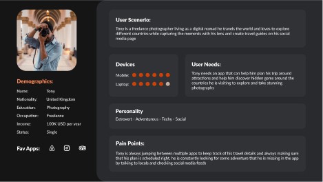
Personas & Assumptions
We created quick user profiles to guide our design choices. By focusing on different needs—like a busy student or a family traveler—we aimed to make sure everyone could find what they need without extra hassle.
We created quick user profiles to guide our design choices. By focusing on different needs—like a busy student or a family traveler—we aimed to make sure everyone could find what they need without extra hassle.
We created quick user profiles to guide our design choices. By focusing on different needs—like a busy student or a family traveler—we aimed to make sure everyone could find what they need without extra hassle.


Business & User frustrations
Primary Frustration
Primary Frustration
Primary Frustration
The biggest problem was the complete absence of a proper map feature. This made it impossible for users to see potential destinations in one place or plan their trips quickly.
The biggest problem was the complete absence of a proper map feature. This made it impossible for users to see potential destinations in one place or plan their trips quickly.
The biggest problem was the complete absence of a proper map feature. This made it impossible for users to see potential destinations in one place or plan their trips quickly.
Secondary Frustration
Secondary Frustration
Secondary Frustration
Users struggled to find the most important actions, while the flow felt scattered and unorganized. As a result, they couldn’t easily plan trips or discover new places, which hurt the overall user experience.
Users struggled to find the most important actions, while the flow felt scattered and unorganized. As a result, they couldn’t easily plan trips or discover new places, which hurt the overall user experience.
Users struggled to find the most important actions, while the flow felt scattered and unorganized. As a result, they couldn’t easily plan trips or discover new places, which hurt the overall user experience.
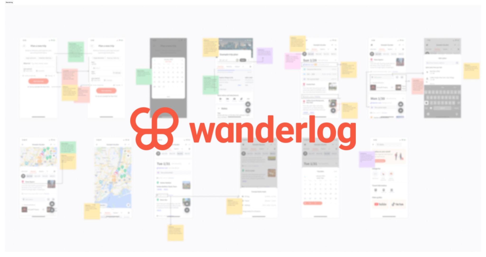
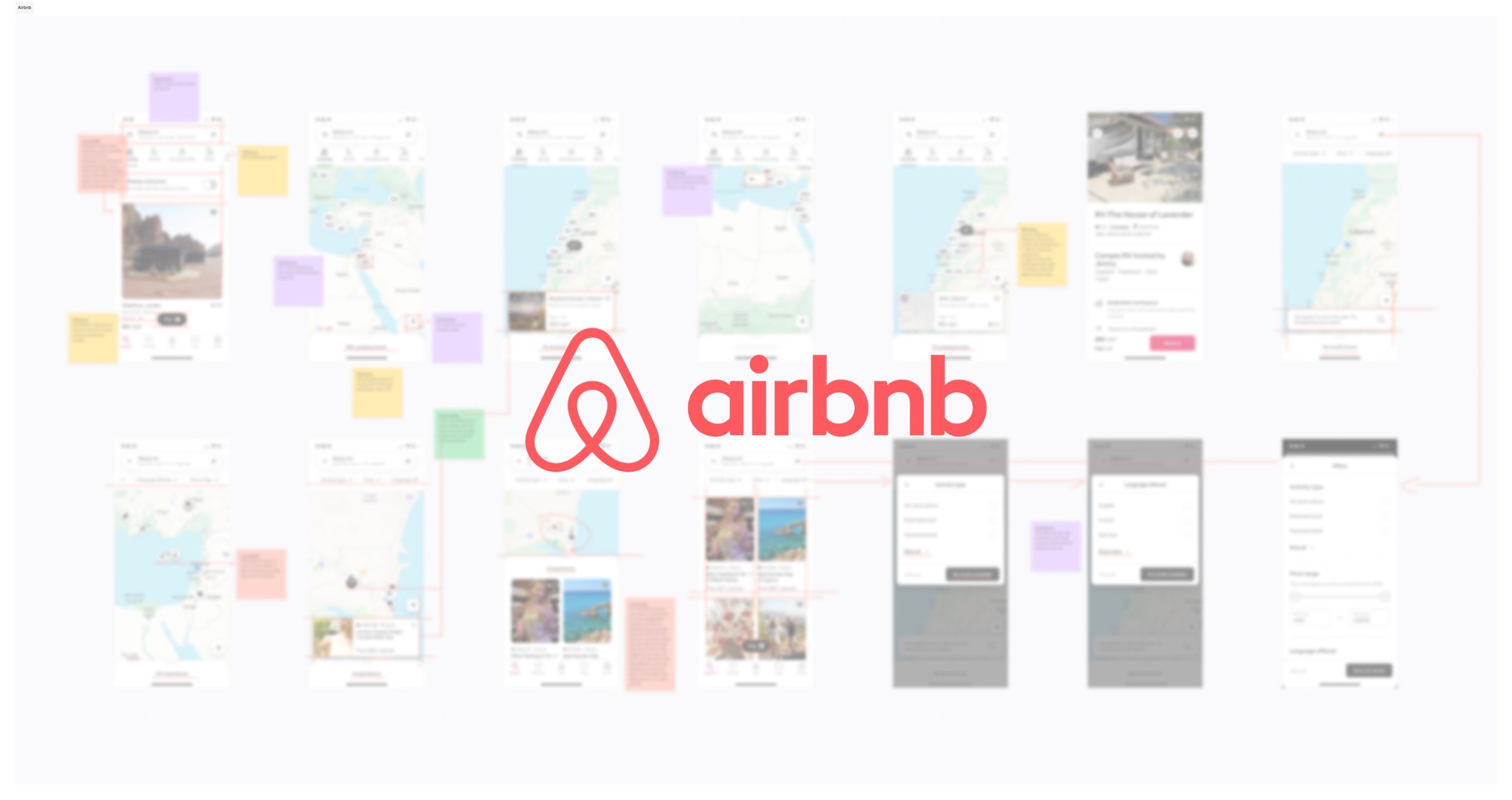
Competitor Benchmarking
We studied planning and map based apps like Wanderlog, Google Maps, and Airbnb to see how they handle trip planning and map experiences. This inspired features such as easy-to-read pins, faster loading Maps, and a clean, user-friendly layout.
We studied planning and map based apps like Wanderlog, Google Maps, and Airbnb to see how they handle trip planning and map experiences. This inspired features such as easy-to-read pins, faster loading Maps, and a clean, user-friendly layout.
We studied planning and map based apps like Wanderlog, Google Maps, and Airbnb to see how they handle trip planning and map experiences. This inspired features such as easy-to-read pins, faster loading Maps, and a clean, user-friendly layout.
Key Learnings
Key Learnings
Key Learnings

Do not overcomplicate things
Multy day trip Showcase
Optimizing route
Mixed transportation model
3 stages of Map pins
Detailed Trip breakdown
Switch from list to map
Tags and filters over map
Limit complexity
Straight to the point
Good filtering
Give users feedback at all time
Ideation & Prioritization
Ideation & Prioritization
Problem Space
Trip planning by itself is a tricky task, so we needed a smarter map that fits into a bigger travel planning flow. Our main goal was to reduce confusion, keep screens simple, and help travelers plan everything from point A to B in just a few taps.
Trip planning by itself is a tricky task, so we needed a smarter map that fits into a bigger travel planning flow. Our main goal was to reduce confusion, keep screens simple, and help travelers plan everything from point A to B in just a few taps.
Trip planning by itself is a tricky task, so we needed a smarter map that fits into a bigger travel planning flow. Our main goal was to reduce confusion, keep screens simple, and help travelers plan everything from point A to B in just a few taps.
Answering the Big Question
Answering the Big Question
Answering the Big Question
How Might We… Make Trip Planning Easier, Faster, And More Enjoyable?
Mind Mapping
We listed ideas like Auto trip generation based on interest, trip cost estimation, a quick remove-and-replace option for plans, and ways to invite friends and collaborate on the same trip.
We listed ideas like Auto trip generation based on interest, trip cost estimation, a quick remove-and-replace option for plans, and ways to invite friends and collaborate on the same trip.
We listed ideas like Auto trip generation based on interest, trip cost estimation, a quick remove-and-replace option for plans, and ways to invite friends and collaborate on the same trip.

What can we improve
Product Page Hierarchy
Search Experience
Color Coding by activity type
What can we add
MAP Experience
Friends invite and collaboration
Trip Dashboard
But… What Comes First?
We used a simple chart to see which features would have the biggest impact for the least effort. That led us to plan three phases:
Phase 0: Basic map, route optimization, and easy swapping of events.
Phase 1: Payment options, cost estimates, social sharing, and a simple AI feature.
Phase 2: Advanced cost estimates, multi-route planning, and full trip collaboration.

User Flows
We mapped out how users would move through the app, from logging in to booking. Then we cut out extra steps, reorganized buttons, and tested simple wireframes to see if the journey felt natural.
We mapped out how users would move through the app, from logging in to booking. Then we cut out extra steps, reorganized buttons, and tested simple wireframes to see if the journey felt natural.
We mapped out how users would move through the app, from logging in to booking. Then we cut out extra steps, reorganized buttons, and tested simple wireframes to see if the journey felt natural.


More then 50% of the drafted flow was removed, while improving on the users journey
More then 50% of the drafted flow was removed, while improving on the users journey
Old Flow
New Flow
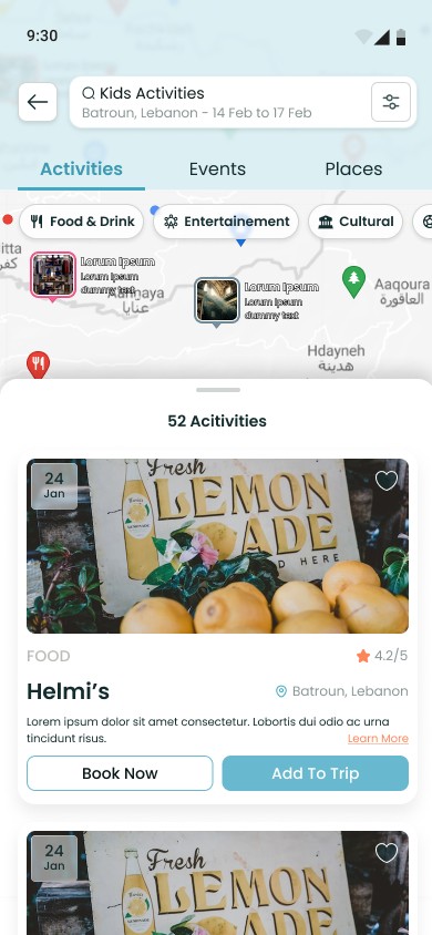
Rapid Prototyping
We crafted these wireframes to put the map experience front and center, reducing extra steps and making trip planning smoother. Each screen is built around quick map views—full, half-screen, or card—and a streamlined flow from search to final itinerary. By consolidating route optimization, add/remove actions, and sharing into one page, we kept everything clear and efficient
We crafted these wireframes to put the map experience front and center, reducing extra steps and making trip planning smoother. Each screen is built around quick map views—full, half-screen, or card—and a streamlined flow from search to final itinerary. By consolidating route optimization, add/remove actions, and sharing into one page, we kept everything clear and efficient
We crafted these wireframes to put the map experience front and center, reducing extra steps and making trip planning smoother. Each screen is built around quick map views—full, half-screen, or card—and a streamlined flow from search to final itinerary. By consolidating route optimization, add/remove actions, and sharing into one page, we kept everything clear and efficient

Styles & Components
Once we were confident in our approach, we switched to high-fidelity designs in Figma. We created a consistent set of colors, fonts, and elements, including the three different map pins—small, medium, and large— with all their categories and color variations to show different types of locations and possible paid ads. This made trip planning look clean, modern, and ready for growth.
Once we were confident in our approach, we switched to high-fidelity designs in Figma. We created a consistent set of colors, fonts, and elements, including the three different map pins—small, medium, and large— with all their categories and color variations to show different types of locations and possible paid ads. This made trip planning look clean, modern, and ready for growth.
Once we were confident in our approach, we switched to high-fidelity designs in Figma. We created a consistent set of colors, fonts, and elements, including the three different map pins—small, medium, and large— with all their categories and color variations to show different types of locations and possible paid ads. This made trip planning look clean, modern, and ready for growth.

Small dots less map clutter, medium pins for the category showcase and high attraction points, and the big pins for advertisement & business revenue stream
Small dots less map clutter, medium pins for the category showcase and high attraction points, and the big pins for advertisement & business revenue stream
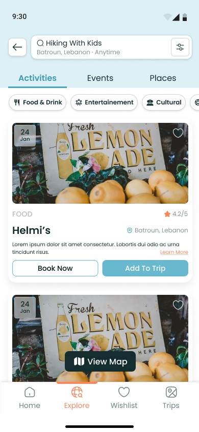
High Fidelity Prototype
These polished prototypes translate our wireframes into a vibrant, user-friendly interface. We introduced a consistent design system, integrating three distinct map pins to create a clear visual hierarchy and offer an extra revenue path. The final screens showcase a refined look, combining easy navigation with an engaging map experience—all tailored to help travelers plan trips in just a few taps.
These polished prototypes translate our wireframes into a vibrant, user-friendly interface. We introduced a consistent design system, integrating three distinct map pins to create a clear visual hierarchy and offer an extra revenue path. The final screens showcase a refined look, combining easy navigation with an engaging map experience—all tailored to help travelers plan trips in just a few taps.
These polished prototypes translate our wireframes into a vibrant, user-friendly interface. We introduced a consistent design system, integrating three distinct map pins to create a clear visual hierarchy and offer an extra revenue path. The final screens showcase a refined look, combining easy navigation with an engaging map experience—all tailored to help travelers plan trips in just a few taps.


Next steps
We delivered a seamless, map-focused app with clearer flows and a new revenue stream through sponsored pins.
Although extensive testing has yet to happen, we plan to conduct user interviews and usability sessions once Traveln.ai allocates the necessary resources. These next steps will help refine the design and ensure the experience is fully tailored to real travelers’ needs.
More Case Studies
More Case Studies
More Case Studies


Load More
What are you waiting for
Get started now, with our 14 days money back guarantee what are you waiting for? Let's build a product your users will love.
14 Days Money Back Guarantee
Pause & Launch At Your Convenience
Transparent Fixed Pricing