
Helping WIM HOF improve their Cold shower experience for new users.
In this case study we had to tackle the WIM HOF app, we focused on the cold shower experience and how to help new users navigate through the app. From the challenge discovery to the challenge complition. Here are some of our findings and how we tackled them
In this case study we had to tackle the WIM HOF app, we focused on the cold shower experience and how to help new users navigate through the app. From the challenge discovery to the challenge complition. Here are some of our findings and how we tackled them
Helping WIM HOF improve their Cold shower experience for new users.
In this case study we had to tackle the WIM HOF app, we focused on the cold shower experience and how to help new users navigate through the app. From the challenge discovery to the challenge complition. Here are some of our findings and how we tackled them
Role
User Research
Product Strategy
UI Design
Interaction Design
Usability Testing
Tools
Figjam
Figma
Maze
Scoop of work
5 weeks
Team of 2
The Problem
Wim Hof app is overhwelming for new users, with too many options for them to start their cold water habit. How can we make it easy for new users to customise, complete and track their cold shower challenge.
Wim Hof app is overhwelming for new users, with too many options for them to start their cold water habit. How can we make it easy for new users to customise, complete and track their cold shower challenge.
Wim Hof app is overhwelming for new users, with too many options for them to start their cold water habit. How can we make it easy for new users to customise, complete and track their cold shower challenge.
The Solution
Helping shift the hierarchy of the app over to the cold shower challenge, gamifying the app, adding rewards of the tribe, giving the user control over the challenge, these where all part of improving the overall user experience and helping those new users feel less overwhelmed by the many options that were previously used
Helping shift the hierarchy of the app over to the cold shower challenge, gamifying the app, adding rewards of the tribe, giving the user control over the challenge, these where all part of improving the overall user experience and helping those new users feel less overwhelmed by the many options that were previously used
Helping shift the hierarchy of the app over to the cold shower challenge, gamifying the app, adding rewards of the tribe, giving the user control over the challenge, these where all part of improving the overall user experience and helping those new users feel less overwhelmed by the many options that were previously used

Usability Review
Starting this Case study, we first went through the Wim Hof app doing a usability audit, highlighting pain points and wow moments as new users to the app. helping us to better understand the app it self and what are the most important parts to change for users
Starting this Case study, we first went through the Wim Hof app doing a usability audit, highlighting pain points and wow moments as new users to the app. helping us to better understand the app it self and what are the most important parts to change for users
Starting this Case study, we first went through the Wim Hof app doing a usability audit, highlighting pain points and wow moments as new users to the app. helping us to better understand the app it self and what are the most important parts to change for users
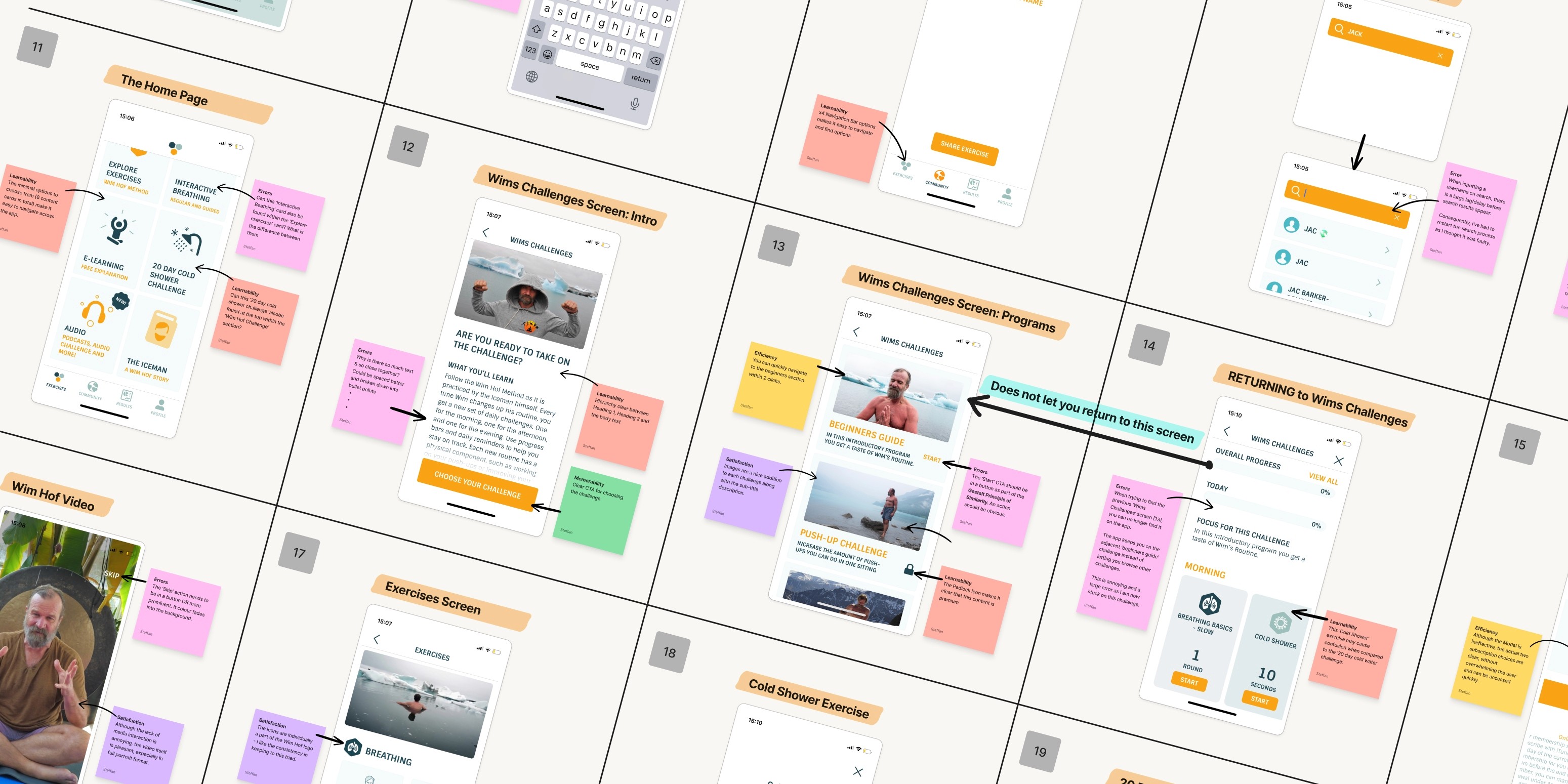
Business & User frustrations
Once downloaded the Wim Hof experience is a total Chaos, from the onboarding screen that promots the community for new users to the homepage that just have so much sections. at this point the user has no idea nor guidance to know what he is supposed to do i order to continue to his cold shower challenge
Once downloaded the Wim Hof experience is a total Chaos, from the onboarding screen that promots the community for new users to the homepage that just have so much sections. at this point the user has no idea nor guidance to know what he is supposed to do i order to continue to his cold shower challenge
Once downloaded the Wim Hof experience is a total Chaos, from the onboarding screen that promots the community for new users to the homepage that just have so much sections. at this point the user has no idea nor guidance to know what he is supposed to do i order to continue to his cold shower challenge
Primary Frustration
Primary Frustration
Primary Frustration
Most of the app is presented with the same card design & no Hierarchy, keeping in mind that most of the app is for premium users only, most users will fail to find a free challenge which can leave us with a higher dropping rate with new users frustrated to guide their way from the homepage. We had to give new users more guidance and less options
Most of the app is presented with the same card design & no Hierarchy, keeping in mind that most of the app is for premium users only, most users will fail to find a free challenge which can leave us with a higher dropping rate with new users frustrated to guide their way from the homepage. We had to give new users more guidance and less options
Most of the app is presented with the same card design & no Hierarchy, keeping in mind that most of the app is for premium users only, most users will fail to find a free challenge which can leave us with a higher dropping rate with new users frustrated to guide their way from the homepage. We had to give new users more guidance and less options
Secondary Frustration
Secondary Frustration
Secondary Frustration
When in the cold shower experience, users have 0 control over the screens until their time is up, NO PAUSE, NO going back, No feedback, just a screen with a timer blocking the app. so any time you press start by accident you are stuck until the time is done. We needed to give the users a bit of control and feedback at this stage
When in the cold shower experience, users have 0 control over the screens until their time is up, NO PAUSE, NO going back, No feedback, just a screen with a timer blocking the app. so any time you press start by accident you are stuck until the time is done. We needed to give the users a bit of control and feedback at this stage
When in the cold shower experience, users have 0 control over the screens until their time is up, NO PAUSE, NO going back, No feedback, just a screen with a timer blocking the app. so any time you press start by accident you are stuck until the time is done. We needed to give the users a bit of control and feedback at this stage
Competitor Benchmarking
Benchamrking 2 Competitors, using LEMES, we went and studied 2 competitor:
1- Cold water therapy (direct competitor)
2- Breathwrk (indirect competitor)
Benchamrking 2 Competitors, using LEMES, we went and studied 2 competitor:
1- Cold water therapy (direct competitor)
2- Breathwrk (indirect competitor)
Benchamrking 2 Competitors, using LEMES, we went and studied 2 competitor:
1- Cold water therapy (direct competitor)
2- Breathwrk (indirect competitor)

Problem Space
We needed a Clearer ans easier path for the new user to access the cold shower challenge, solve the hierarchy problem, give users their control back, adjust the difficulity Logic to seperate it from the time that will be spent in the cold shower.
So we asked:
We needed a Clearer ans easier path for the new user to access the cold shower challenge, solve the hierarchy problem, give users their control back, adjust the difficulity Logic to seperate it from the time that will be spent in the cold shower.
So we asked:
We needed a Clearer ans easier path for the new user to access the cold shower challenge, solve the hierarchy problem, give users their control back, adjust the difficulity Logic to seperate it from the time that will be spent in the cold shower.
So we asked:
How Might We Make It Easier For New Users To Complete Their First Shower Challenge?
How Might We Make It Easier For New Users To Complete Their First Shower Challenge?
How Might We Make It Easier For New Users To Complete Their First Shower Challenge?
Ideation
After a long brainstorming session, we organized our ideas in a Mind Map devided into 2 main categories, adding and improving. after that we did an 8min sketching brainstorm picking the main ideas that stuck and voting for the 8 best ideas that should be part of our solution. and using Priority metrix we classified these ideas based on the amount of effort it will take and the Impact that these will have.
After a long brainstorming session, we organized our ideas in a Mind Map devided into 2 main categories, adding and improving. after that we did an 8min sketching brainstorm picking the main ideas that stuck and voting for the 8 best ideas that should be part of our solution. and using Priority metrix we classified these ideas based on the amount of effort it will take and the Impact that these will have.
After a long brainstorming session, we organized our ideas in a Mind Map devided into 2 main categories, adding and improving. after that we did an 8min sketching brainstorm picking the main ideas that stuck and voting for the 8 best ideas that should be part of our solution. and using Priority metrix we classified these ideas based on the amount of effort it will take and the Impact that these will have.
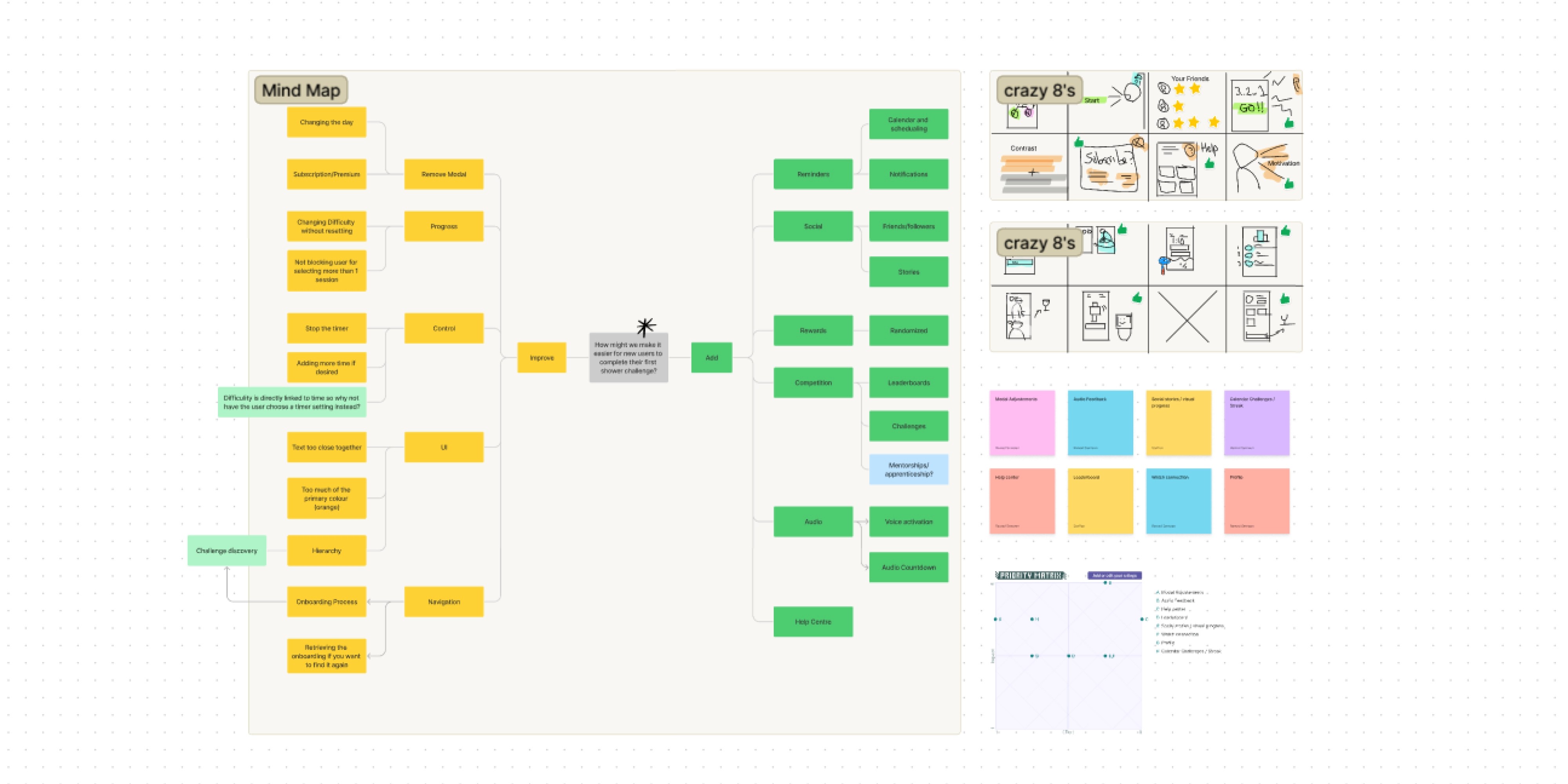
What can we add
Upon many ideas, we choose to add a social factor & Audio feedback. As a reward of the tribe a story like behavior that will enable the users to share their acheivements with their network on the homepage leading to more investement in the app and a more competitive+game like setting. the Audio feedback felt necessary also since the users won't have their phones inside the shower and that will help them stay in the loop of what stage of the shower they are at
Upon many ideas, we choose to add a social factor & Audio feedback. As a reward of the tribe a story like behavior that will enable the users to share their acheivements with their network on the homepage leading to more investement in the app and a more competitive+game like setting. the Audio feedback felt necessary also since the users won't have their phones inside the shower and that will help them stay in the loop of what stage of the shower they are at
Upon many ideas, we choose to add a social factor & Audio feedback. As a reward of the tribe a story like behavior that will enable the users to share their acheivements with their network on the homepage leading to more investement in the app and a more competitive+game like setting. the Audio feedback felt necessary also since the users won't have their phones inside the shower and that will help them stay in the loop of what stage of the shower they are at
What can we improve
Improving the color palette, hierarchy & the challenge set up of the app was a necessity and not a choice.
Most importantly was the challenge discovery and making it very easy with little to no effort for a new user to start his challenge
having a less complicated challenge set up screen & dividing the difficulty from the time it self because it was very confusing
and having a calmer more cold color palette
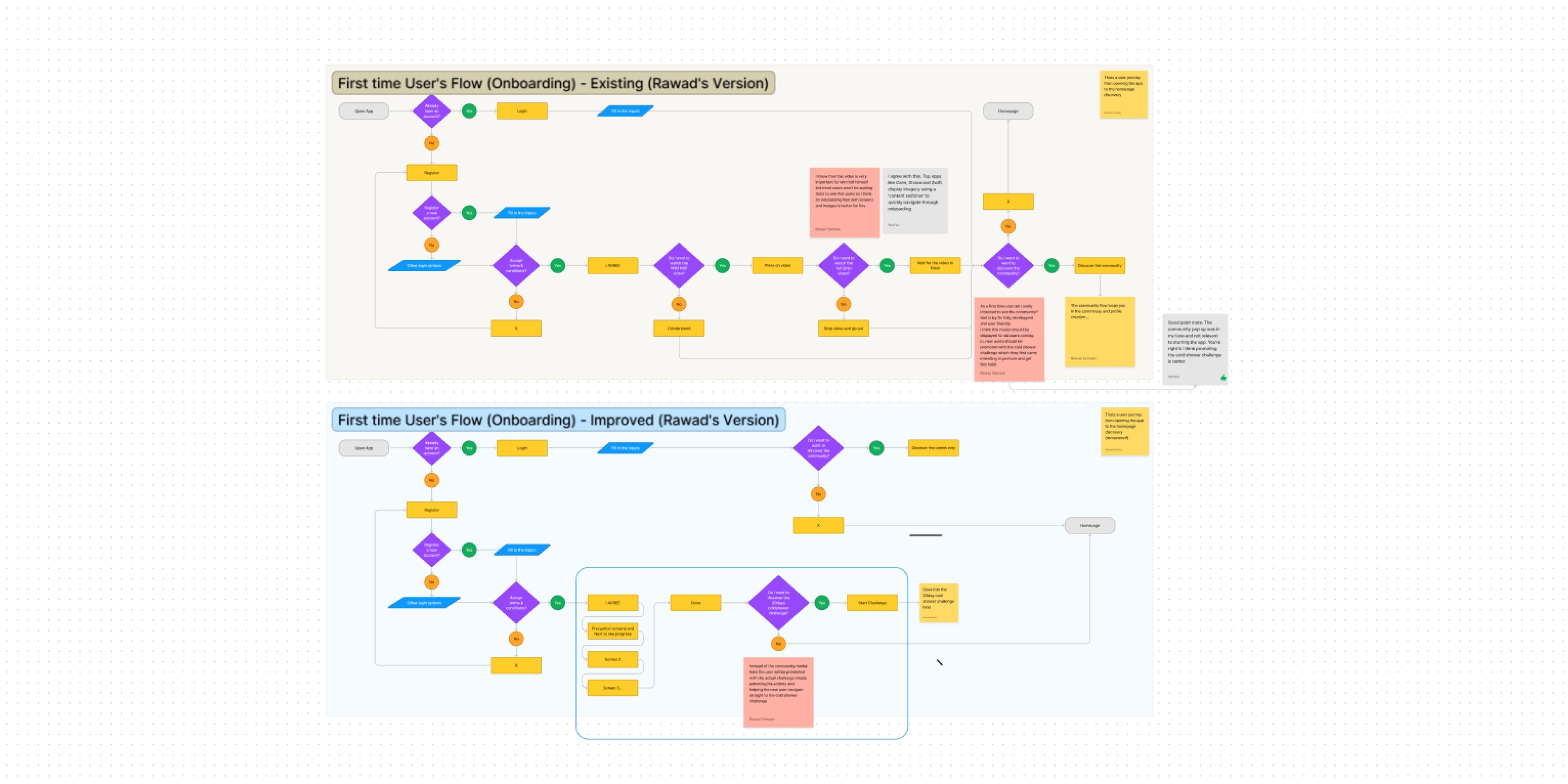
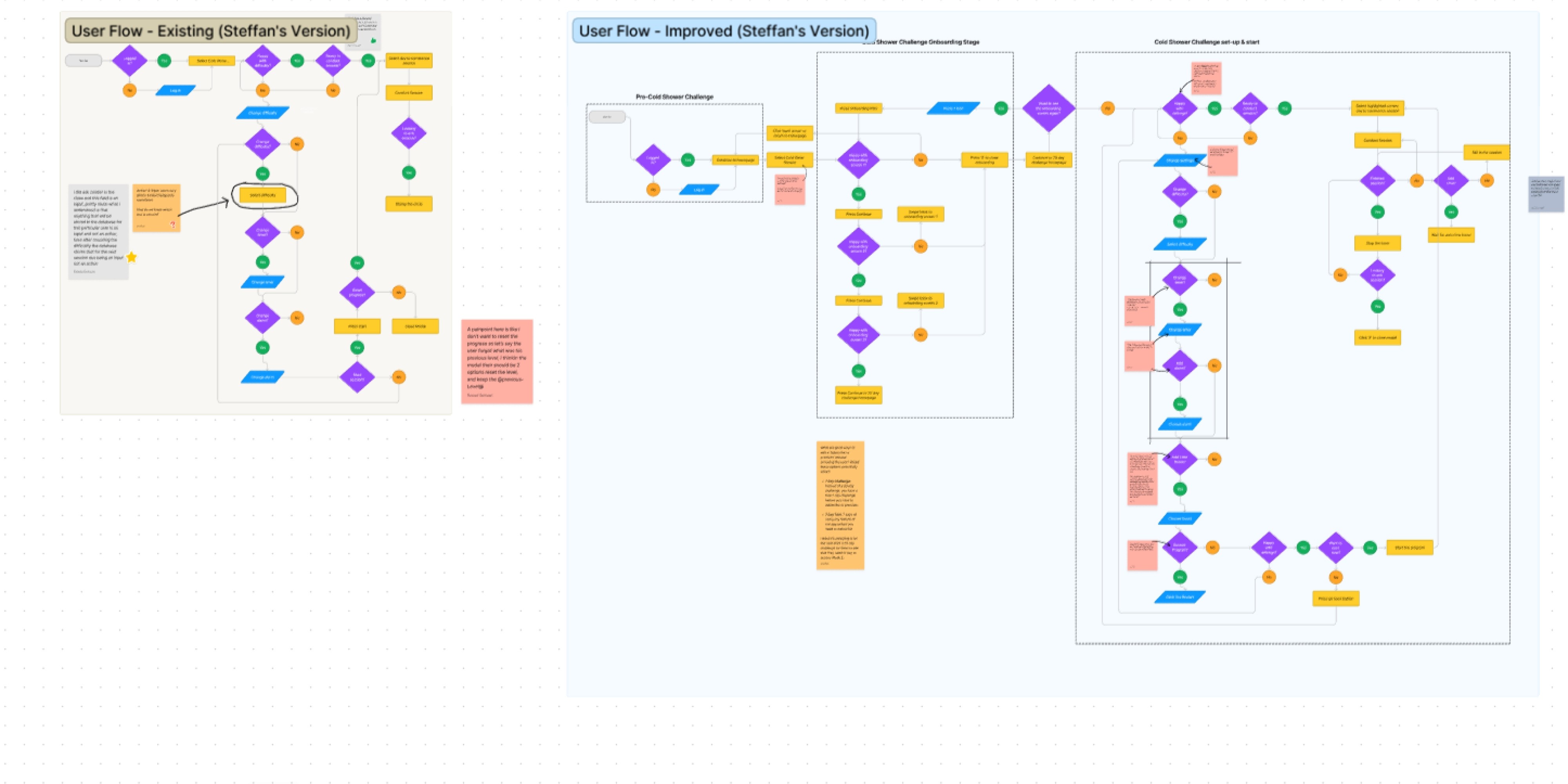
User Flows
Iterating upon the existing user flows, we tackled the user from 2 starts and end:
1- from the log in till the challenge discovery
2- from the homepage till he finishes the cold shower
Iterating upon the existing user flows, we tackled the user from 2 starts and end:
1- from the log in till the challenge discovery
2- from the homepage till he finishes the cold shower
Iterating upon the existing user flows, we tackled the user from 2 starts and end:
1- from the log in till the challenge discovery
2- from the homepage till he finishes the cold shower
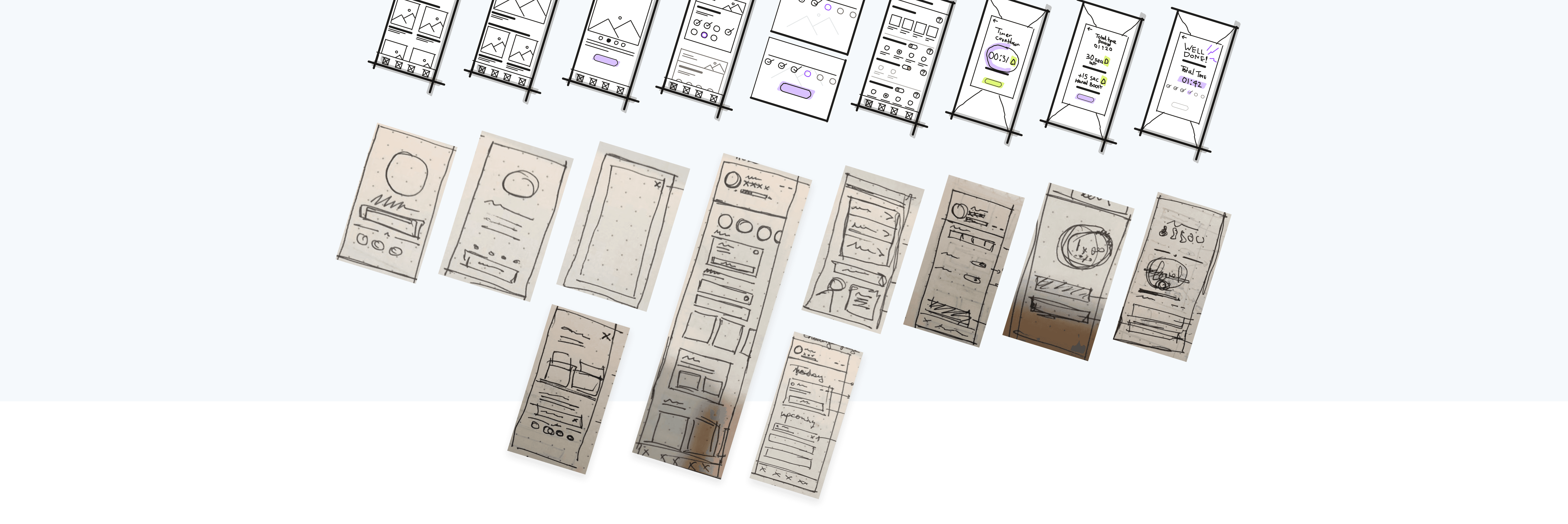
Rapid Prototyping
Sketching some rapid wireframes, lot's of the sketches didn't make it to the final product. my teammate choose to wireframe inside figjam, i prefer pen and paper which allows me to rapidly sketch and scrap ideas before commiting and putting too much time into figjam and figma wireframing at this stage
Sketching some rapid wireframes, lot's of the sketches didn't make it to the final product. my teammate choose to wireframe inside figjam, i prefer pen and paper which allows me to rapidly sketch and scrap ideas before commiting and putting too much time into figjam and figma wireframing at this stage
Sketching some rapid wireframes, lot's of the sketches didn't make it to the final product. my teammate choose to wireframe inside figjam, i prefer pen and paper which allows me to rapidly sketch and scrap ideas before commiting and putting too much time into figjam and figma wireframing at this stage
Styles & Components
Starting with the UI styles, we chose a colder color scheme to represent the Wim Hof routines and the cold shower experience with colors mainly in the blue, and we decided to stay in a Monochromatic palette hacing our secondary colors in the grey area, setting our components buttons and all the app elements around this new palette
Starting with the UI styles, we chose a colder color scheme to represent the Wim Hof routines and the cold shower experience with colors mainly in the blue, and we decided to stay in a Monochromatic palette hacing our secondary colors in the grey area, setting our components buttons and all the app elements around this new palette
Starting with the UI styles, we chose a colder color scheme to represent the Wim Hof routines and the cold shower experience with colors mainly in the blue, and we decided to stay in a Monochromatic palette hacing our secondary colors in the grey area, setting our components buttons and all the app elements around this new palette

High Fidelity Prototype
Summarise the final prototype that you created…
Summarise the final prototype that you created…
Summarise the final prototype that you created…
More Case Studies
More Case Studies
More Case Studies


Load More
What are you waiting for
Get started now, with our 14 days money back guarantee what are you waiting for? Let's build a product your users will love.
14 Days Money Back Guarantee
Pause & Launch At Your Convenience
Transparent Fixed Pricing